Клининг · Познань · сайт под ключ · UA + PL
Mopiko clean
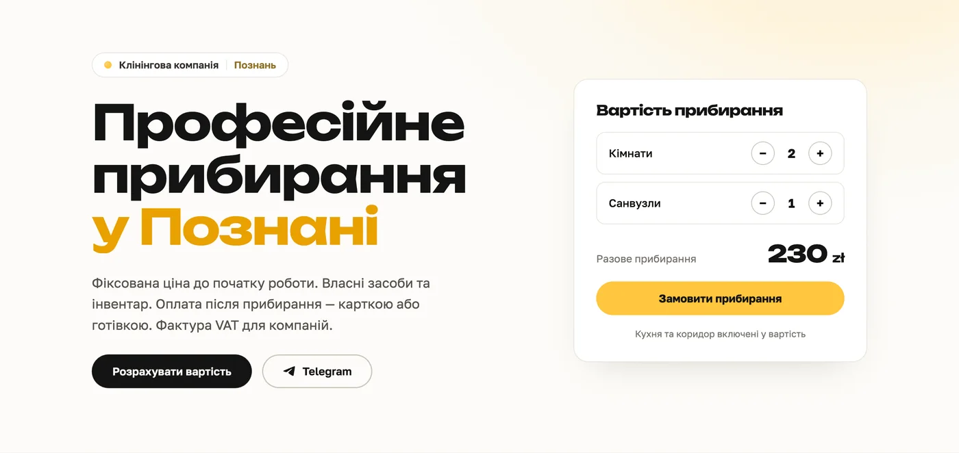
Рабочий инструмент продаж: сам считает цену, принимает заказы и приводит клиентов из поиска — 24/7, на двух языках и в рамках закона.
Полный цикл: стратегия · UX · дизайн · вёрстка · копирайт (UA/PL) · SEO · GDPR · доступность · деплой
00 — О проекте
Каждая деталь работает на одно число — сколько посетителей станут заявкой. Внешне это сайт, по сути — воронка, которая продаёт даже пока вы спите.
- Клиент
- Mopiko — клининговая компания, Познань (Польша)
- Аудитория
- украинцы и поляки, которым нужна уборка — быстро и понятно
- Задача
- максимум заявок: убрать всё лишнее между «зашёл» и «написал»
- Языки
- украинская и польская версии — отдельные страницы с hreflang под Google
- Качество
- PageSpeed 85 · 100 · 100 · 100, GDPR, доступность
- Роль
- дизайн, вёрстка, SEO, GDPR, доступность, деплой — один специалист
01 — Контекст
Клиент решает за секунды
Человек ищет уборку в стрессе: гости на пороге, переезд, после ремонта. Ему некогда изучать длинные лендинги и ждать ответа менеджера — нужна цена и простой способ заказать, прямо сейчас.
Значит, сайт должен сделать одно действительно хорошо: максимально сократить путь от «зашёл» до «написал» — и по дороге снять все страхи: сколько стоит, что входит, можно ли доверять.
02 — Что сделано
Сайт как инструмент продаж
Продаёт за вас — превращает посетителя в заявку
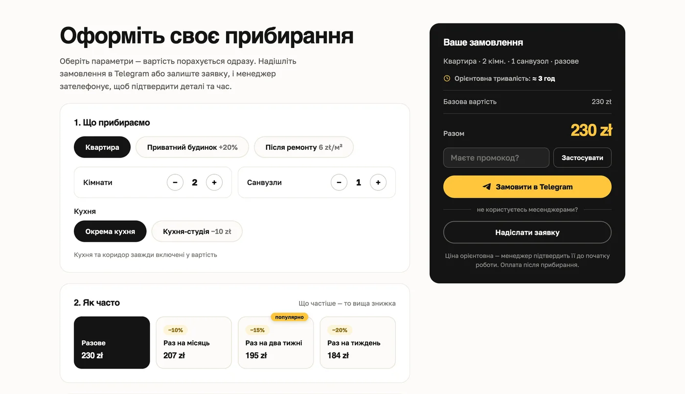
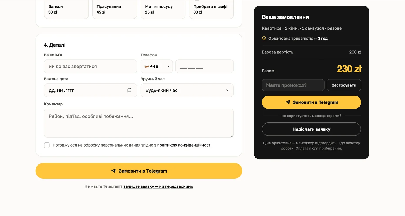
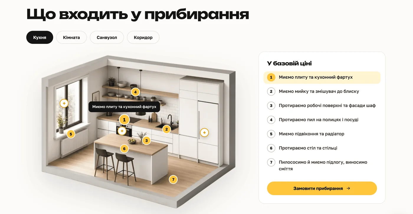
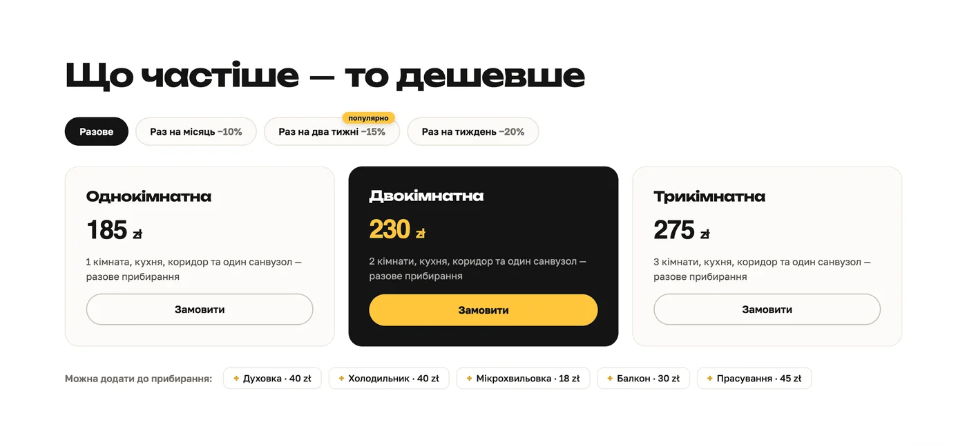
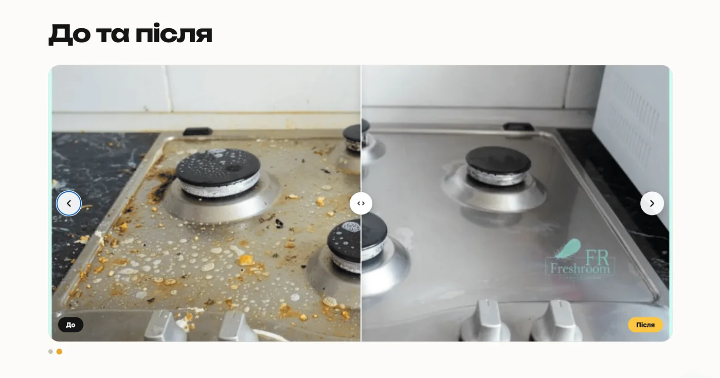
Онлайн-калькулятор считает цену сразу: тип жилья, комнаты, санузлы, площадь, доп-опции — всё в реальном времени, без менеджера. Заказ уходит в Telegram одним кликом готовым сообщением со всеми деталями; для тех, кто без мессенджеров, — «оставьте заявку, перезвоним». Полей минимум (только контакт и дата): каждое лишнее поле роняет конверсию.
Приводит клиентов из интернета
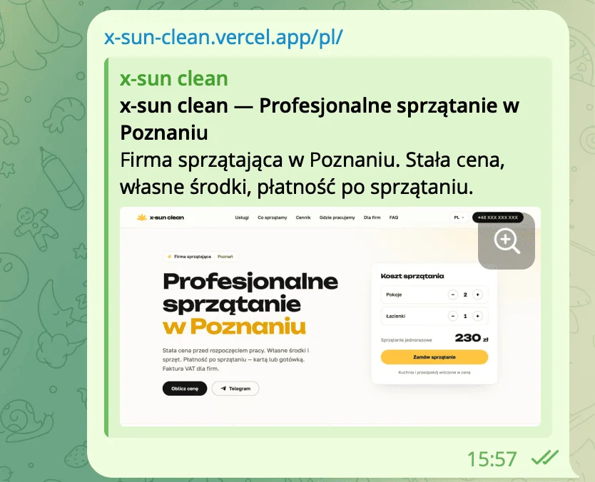
Украинская и польская версии сделаны как отдельные страницы с hreflang — Google показывает нужную версию нужному человеку на его языке. Это удваивает охват и даёт бесплатный поток из поиска. Сайт одинаково хорош на любом экране (больше половины заходят с телефона), а свой хостинг шрифтов, сжатые изображения и мировая CDN держат его быстрым — быстрый сайт Google ставит выше.
Защищает бизнес от штрафов
Политика конфиденциальности и cookie-баннер с согласием по GDPR / RODO: до согласия не отслеживается ничего. Нарушение — штрафы до 20 млн € или 4% оборота, так что это юридический щит, а не косметика. Плюс доступность: работа с клавиатуры, скринридеры, контраст, «меньше анимации» — тоже требование ЕС и заодно шире аудитория.

Сделано, чтобы жить и расти
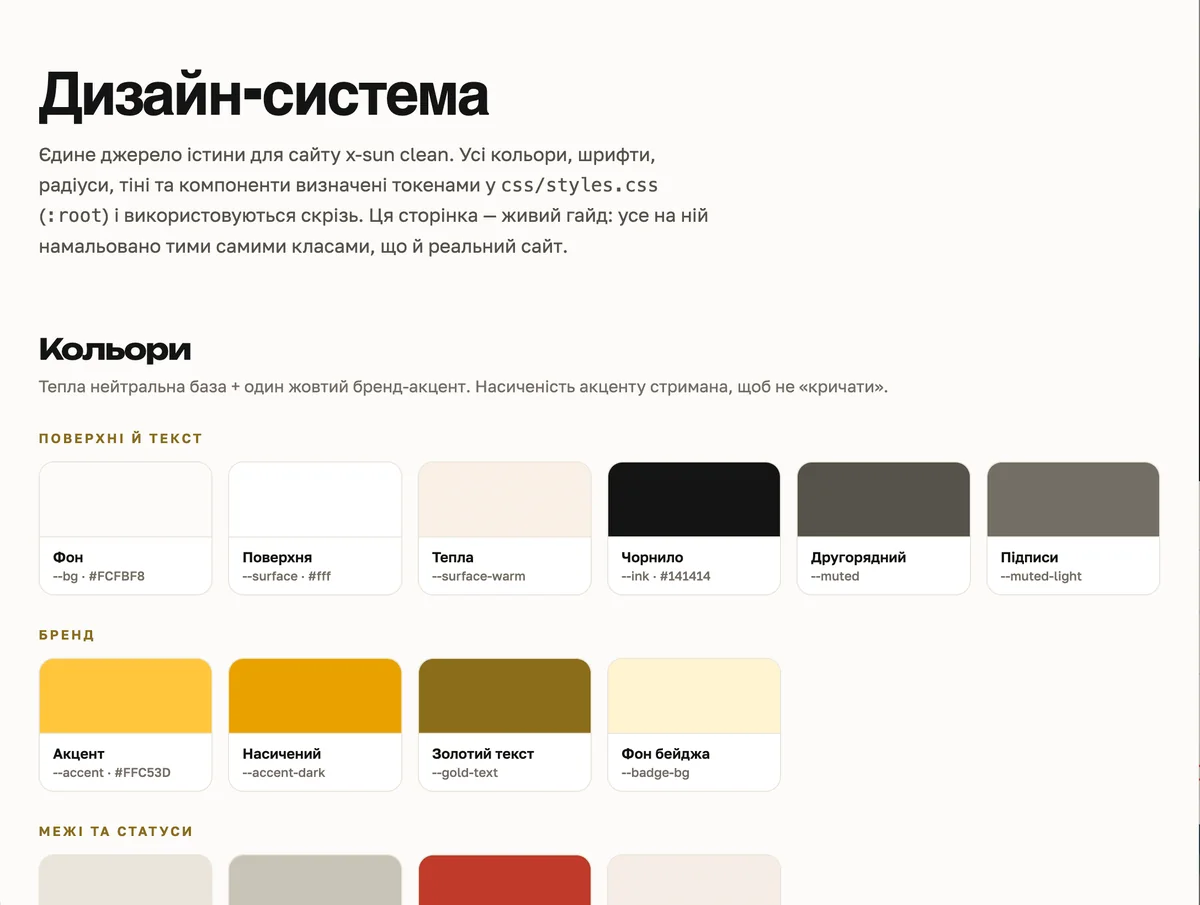
Единая дизайн-система: все цвета, шрифты и кнопки — на «переключателях» в одном месте, поменять оттенок бренда по всему сайту можно за минуты. Автодеплой: любое изменение на живом сайте за минуту. Плюс десятки часов «невидимой» работы — тестирование каждой кнопки и формы на всех устройствах и браузерах.
03 — Ценность
Один сайт — работа целой команды
За каждой мелочью здесь — отдельная профессия. Я собрал их в один работающий механизм:
04 — Итог
Что в итоге заложено
Инструмент продаж
Калькулятор и заказ в Telegram превращают посетителя в заявку без участия менеджера.
Поток из Google
Две версии (UA/PL) с hreflang ловят и украинцев, и поляков — бесплатный трафик из поиска.
Быстро и везде
PageSpeed 85/100/100/100, ровно от телефона до широкого монитора.
Чисто по закону
GDPR/RODO и доступность — щит от штрафов и заодно шире аудитория.
Готов расти
Дизайн-система и автодеплой — развивать сайт быстро, дёшево и без риска что-то сломать.
Нужен сайт, который
приводит клиентов?
Я строю цифровое присутствие под заявки и продажи: калькулятор, SEO, GDPR, аналитика — всё, что превращает трафик в клиентов.